Android自定義控件之圓形進(jìn)度條動(dòng)畫
本文實(shí)例為大家分享了Android實(shí)現(xiàn)圓形進(jìn)度條動(dòng)畫的具體代碼,供大家參考,具體內(nèi)容如下
首先貼上圖片:
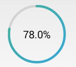
額,感覺還行吧,就是進(jìn)度條的顏色丑了點(diǎn),不過咱是程序員,不是美工,配色這種問題當(dāng)然不在考慮范圍之內(nèi)了。
下面說重點(diǎn),如何來寫一個(gè)這樣的自定義控件。
首先,需要有一個(gè)灰色的底圖,來作為未填充時(shí)的進(jìn)度條;
然后,根據(jù)傳入的當(dāng)前進(jìn)度值,繪制填充時(shí)的進(jìn)度圓弧,這段圓弧所對(duì)應(yīng)的圓心角,由當(dāng)前進(jìn)度與進(jìn)度的最大值(一般是100)的比值計(jì)算得出;
其次,根據(jù)進(jìn)度值繪制文字提示;
最后,重繪控件,加上動(dòng)畫,從而達(dá)到顯示進(jìn)度的效果。
代碼如下:
1、attrs.xml
<?xml version='1.0' encoding='utf-8'?><resources> <declare-styleable name='circleProgressBar'> <attr name='circleWidth' format='dimension' /> <attr name='betaAngle' format='integer' /> <attr name='firstColor' format='color' /> <attr name='secondColor' format='color' /> </declare-styleable> </resources>
2、CircleProgressBar.java
package com.ctgu.circleprogressbar; import android.animation.ValueAnimator;import android.content.Context;import android.content.res.TypedArray;import android.graphics.Canvas;import android.graphics.Color;import android.graphics.LinearGradient;import android.graphics.Paint;import android.graphics.Paint.FontMetricsInt;import android.graphics.Rect;import android.graphics.RectF;import android.graphics.Shader;import android.util.AttributeSet;import android.util.TypedValue;import android.view.View;import android.view.animation.OvershootInterpolator; public class CircleProgressBar extends View{ /** * 進(jìn)度條最大值,默認(rèn)為100 */ private int maxValue = 100; /** * 當(dāng)前進(jìn)度值 */ private int currentValue = 0; /** * 每次掃過的角度,用來設(shè)置進(jìn)度條圓弧所對(duì)應(yīng)的圓心角,alphaAngle=(currentValue/maxValue)*360 */ private float alphaAngle; /** * 底部圓弧的顏色,默認(rèn)為Color.LTGRAY */ private int firstColor; /** * 進(jìn)度條圓弧塊的顏色 */ private int secondColor; /** * 圓環(huán)的寬度 */ private int circleWidth; /** * 畫圓弧的畫筆 */ private Paint circlePaint; /** * 畫文字的畫筆 */ private Paint textPaint; /** * 漸變圓周顏色數(shù)組 */ private int[] colorArray = new int[] { Color.parseColor('#27B197'), Color.parseColor('#00A6D5') };// /** * 通過代碼創(chuàng)建時(shí)才使用 * * @param context */ public CircleProgressBar(Context context) { this(context, null); } /** * 當(dāng)從xml中加載view的時(shí)候,這個(gè)構(gòu)造器才會(huì)被調(diào)用。其第二個(gè)參數(shù)中就包含自定義的屬性。 * * @param context * 上下文 * @param attrs * 自定義屬性 */ public CircleProgressBar(Context context, AttributeSet attrs) { this(context, attrs, 0); } /** * 從xml加載時(shí)執(zhí)行和應(yīng)用一個(gè)特定的風(fēng)格。這里有兩種方式,一是從theme中獲得,二是從style中獲得。 * 第三個(gè)參數(shù)官方有這樣的說明: defStyle - The default style to apply to this view. If 0, * no style will be applied (beyond what is included in the theme). This may * either be an attribute resource, whose value will be retrieved from the * current theme, or an explicit style resource. * 默認(rèn)的風(fēng)格會(huì)被應(yīng)用到這個(gè)view上。如果是0,沒有風(fēng)格將會(huì)被應(yīng)用 * (除了被包含在主題中)。這個(gè)也許是一個(gè)屬性的資源,它的值是從當(dāng)前的主題中檢索,或者是一個(gè)明確的風(fēng)格資源。 * * @param context * 上下文 * @param attrs * 自定義的屬性 * @param defStyleAttr * 自定義風(fēng)格 */ public CircleProgressBar(Context context, AttributeSet attrs, int defStyleAttr) { super(context, attrs, defStyleAttr); TypedArray ta = context.getTheme().obtainStyledAttributes(attrs, R.styleable.circleProgressBar, defStyleAttr, 0); int n = ta.getIndexCount(); for (int i = 0; i < n; i++) { int attr = ta.getIndex(i); switch (attr) { case R.styleable.circleProgressBar_firstColor: firstColor = ta.getColor(attr, Color.LTGRAY); // 默認(rèn)底色為亮灰色 break; case R.styleable.circleProgressBar_secondColor: secondColor = ta.getColor(attr, Color.BLUE); // 默認(rèn)進(jìn)度條顏色為藍(lán)色 break; case R.styleable.circleProgressBar_circleWidth: circleWidth = ta.getDimensionPixelSize(attr, (int) TypedValue.applyDimension( TypedValue.COMPLEX_UNIT_DIP, 6, getResources().getDisplayMetrics())); // 默認(rèn)圓弧寬度為6dp break; default: break; } } ta.recycle(); circlePaint = new Paint(); circlePaint.setAntiAlias(true); // 抗鋸齒 circlePaint.setDither(true); // 防抖動(dòng) circlePaint.setStrokeWidth(circleWidth); textPaint = new Paint(); textPaint.setAntiAlias(true); textPaint.setDither(true); } @Override protected void onMeasure(int widthMeasureSpec, int heightMeasureSpec) {// 分別獲取期望的寬度和高度,并取其中較小的尺寸作為該控件的寬和高 int measureWidth = MeasureSpec.getSize(widthMeasureSpec); int measureHeight = MeasureSpec.getSize(heightMeasureSpec); setMeasuredDimension(Math.min(measureWidth, measureHeight), Math.min(measureWidth, measureHeight)); } @Override protected void onDraw(Canvas canvas) { int center = this.getWidth() / 2; int radius = center - circleWidth / 2; drawCircle(canvas, center, radius); // 繪制進(jìn)度圓弧 drawText(canvas, center, radius); } /** * 繪制進(jìn)度圓弧 * * @param canvas * 畫布對(duì)象 * @param center * 圓心的x和y坐標(biāo) * @param radius * 圓的半徑 */ private void drawCircle(Canvas canvas, int center, int radius) { circlePaint.setShader(null); // 清除上一次的shader circlePaint.setColor(firstColor); // 設(shè)置底部圓環(huán)的顏色,這里使用第一種顏色 circlePaint.setStyle(Paint.Style.STROKE); // 設(shè)置繪制的圓為空心 canvas.drawCircle(center, center, radius, circlePaint); // 畫底部的空心圓 RectF oval = new RectF(center - radius, center - radius, center + radius, center + radius); // 圓的外接正方形 // 繪制顏色漸變圓環(huán) // shader類是Android在圖形變換中非常重要的一個(gè)類。Shader在三維軟件中我們稱之為著色器,其作用是來給圖像著色。 LinearGradient linearGradient = new LinearGradient(circleWidth, circleWidth, getMeasuredWidth() - circleWidth, getMeasuredHeight() - circleWidth, colorArray, null, Shader.TileMode.MIRROR); circlePaint.setShader(linearGradient); circlePaint.setShadowLayer(10, 10, 10, Color.RED); circlePaint.setColor(secondColor); // 設(shè)置圓弧的顏色 circlePaint.setStrokeCap(Paint.Cap.ROUND); // 把每段圓弧改成圓角的 alphaAngle = currentValue * 360.0f / maxValue * 1.0f; // 計(jì)算每次畫圓弧時(shí)掃過的角度,這里計(jì)算要注意分母要轉(zhuǎn)為float類型,否則alphaAngle永遠(yuǎn)為0 canvas.drawArc(oval, -90, alphaAngle, false, circlePaint); } /** * 繪制文字 * * @param canvas * 畫布對(duì)象 * @param center * 圓心的x和y坐標(biāo) * @param radius * 圓的半徑 */ private void drawText(Canvas canvas, int center, int radius) { float result = (currentValue * 100.0f / maxValue * 1.0f); // 計(jì)算進(jìn)度 String percent = String.format('%.1f', result) + '%'; textPaint.setTextAlign(Paint.Align.CENTER); // 設(shè)置文字居中,文字的x坐標(biāo)要注意 textPaint.setColor(Color.BLACK); // 設(shè)置文字顏色 textPaint.setTextSize(40); // 設(shè)置要繪制的文字大小 textPaint.setStrokeWidth(0); // 注意此處一定要重新設(shè)置寬度為0,否則繪制的文字會(huì)重疊 Rect bounds = new Rect(); // 文字邊框 textPaint.getTextBounds(percent, 0, percent.length(), bounds); // 獲得繪制文字的邊界矩形 FontMetricsInt fontMetrics = textPaint.getFontMetricsInt(); // 獲取繪制Text時(shí)的四條線 int baseline = center + (fontMetrics.bottom - fontMetrics.top) / 2 - fontMetrics.bottom; // 計(jì)算文字的基線,方法見http://blog.csdn.net/harvic880925/article/details/50423762 canvas.drawText(percent, center, baseline, textPaint); // 繪制表示進(jìn)度的文字 } /** * 設(shè)置圓環(huán)的寬度 * * @param width */ public void setCircleWidth(int width) { this.circleWidth = (int) TypedValue.applyDimension(TypedValue.COMPLEX_UNIT_DIP, width, getResources() .getDisplayMetrics()); circlePaint.setStrokeWidth(circleWidth); invalidate(); } /** * 設(shè)置圓環(huán)的底色,默認(rèn)為亮灰色LTGRAY * * @param color */ public void setFirstColor(int color) { this.firstColor = color; circlePaint.setColor(firstColor); invalidate(); } /** * 設(shè)置進(jìn)度條的顏色,默認(rèn)為藍(lán)色<br> * * @param color */ public void setSecondColor(int color) { this.secondColor = color; circlePaint.setColor(secondColor); invalidate(); } /** * 設(shè)置進(jìn)度條漸變色顏色數(shù)組 * * @param colors * 顏色數(shù)組,類型為int[] */ public void setColorArray(int[] colors) { this.colorArray = colors; invalidate(); } /** * 按進(jìn)度顯示百分比 * * @param progress * 進(jìn)度,值通常為0到100 */ public void setProgress(int progress) { int percent = progress * maxValue / 100; if (percent < 0) { percent = 0; } if (percent > 100) { percent = 100; } this.currentValue = percent; invalidate(); } /** * 按進(jìn)度顯示百分比,可選擇是否啟用數(shù)字動(dòng)畫 * * @param progress * 進(jìn)度,值通常為0到100 * @param useAnimation * 是否啟用動(dòng)畫,true為啟用 */ public void setProgress(int progress, boolean useAnimation) { int percent = progress * maxValue / 100; if (percent < 0) { percent = 0; } if (percent > 100) { percent = 100; } if (useAnimation) // 使用動(dòng)畫 { ValueAnimator animator = ValueAnimator.ofInt(0, percent); animator.addUpdateListener(new ValueAnimator.AnimatorUpdateListener() { @Override public void onAnimationUpdate(ValueAnimator animation) { currentValue = (int) animation.getAnimatedValue(); invalidate(); } }); animator.setInterpolator(new OvershootInterpolator()); animator.setDuration(1000); animator.start(); } else { setProgress(progress); } }}
3、activity_main.xml
<RelativeLayout xmlns:android='http://schemas.android.com/apk/res/android' xmlns:tools='http://schemas.android.com/tools' xmlns:lh2='http://schemas.android.com/apk/res/com.ctgu.circleprogressbar' android:layout_width='match_parent' android:layout_height='match_parent' > <com.ctgu.circleprogressbar.CircleProgressBar android: android:layout_width='150dp' android:layout_height='150dp' android:layout_centerHorizontal='true' android:layout_gravity='center' android:layout_marginTop='20dp' lh2:circleWidth='6dp' lh2:firstColor='#d3d3d3' lh2:secondColor='#3B95C8' /> <SeekBar android: android:layout_width='match_parent' android:layout_height='wrap_content' android:layout_alignParentBottom='true' android:layout_marginBottom='40dp' android:layout_marginLeft='10dp' android:layout_marginRight='10dp' android:background='#778899' /> </RelativeLayout>
4、MainActivity.java
package com.ctgu.circleprogressbar; import android.app.Activity;import android.graphics.Color;import android.os.Bundle;import android.os.Handler;import android.widget.SeekBar; public class MainActivity extends Activity{ private CircleProgressBar circleProgressBar; // 自定義的進(jìn)度條 private SeekBar seekbar; // 拖動(dòng)條 private int[] colors = new int[] { Color.parseColor('#27B197'), Color.parseColor('#00A6D5') }; @Override protected void onCreate(Bundle savedInstanceState) { super.onCreate(savedInstanceState); setContentView(R.layout.activity_main); circleProgressBar = (CircleProgressBar) findViewById(R.id.circleProgressBar);// circleProgressBar.setFirstColor(Color.LTGRAY);// circleProgressBar.setColorArray(colors); //覺得進(jìn)度條顏色丑的,這里可以自行傳入一個(gè)顏色漸變數(shù)組。// circleProgressBar.setCircleWidth(6); seekbar = (SeekBar) findViewById(R.id.seekbar); seekbar.setMax(100); seekbar.setOnSeekBarChangeListener(new SeekBar.OnSeekBarChangeListener() { @Override public void onStopTrackingTouch(SeekBar seekBar) { } @Override public void onStartTrackingTouch(SeekBar seekBar) { } @Override public void onProgressChanged(SeekBar seekBar, int progress, boolean fromUser) { if (fromUser) { // circleProgressBar.setProgress(progress); //不使用動(dòng)畫 circleProgressBar.setProgress(progress, true); // 使用數(shù)字過渡動(dòng)畫 } } }); }}
代碼注釋很詳細(xì)了,基本上了解自定義控件的都看得懂。
以上就是本文的全部?jī)?nèi)容,希望對(duì)大家的學(xué)習(xí)有所幫助,也希望大家多多支持好吧啦網(wǎng)。
相關(guān)文章:

 網(wǎng)公網(wǎng)安備