python畫圖常規設置方式
python繪圖的包大家應該不會陌生,但是,對圖的常規設置不一定會知道(其實自己也是才知道的),比如:坐標軸的字體大小、顏色設置;標題的字體顏色大小設置;線的粗細、顏色;圖片風格的設置等。了解這些常規設置必定會讓圖片更加美觀。
下面就具體來說說matplotlib中有哪些常規設置。
我主要總結了這幾個函數:
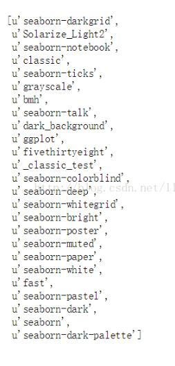
plt.style.use()函數;可以對圖片的整體風格進行設置。可以通過plt.style.availabel知道一共有多少種主題。
import matplotlib.pyplot as pltimport numpy as npimport pandas as pdimport matplotlib as mplprint plt.style.availabel
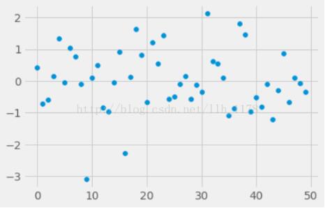
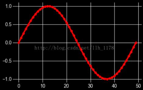
我們試用其中兩個主題。
plt.style.use('fivethirtyeight')data = np.random.randn(50)plt.scatter(range(50), data)
with plt.style.context((’dark_background’)): plt.plot(np.sin(np.linspace(0, 2 * np.pi)), ’r-o’) # 'r-o'表示紅色的點用線連接起來。plt.show()
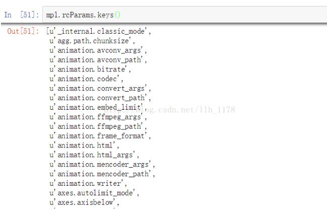
mpl.rcParams()函數;這個函數可以設置圖片的坐標軸以及標題的字體大小、顏色、寬度等。同時,也可以用mpl.rcParams.keys()進行查看有哪些設置。
mpl.rcParams[’xtick.labelsize’] = 16mpl.rcParams['ytick.color'] = ’b’plt.plot(range(50), data, ’g^’)plt.show()
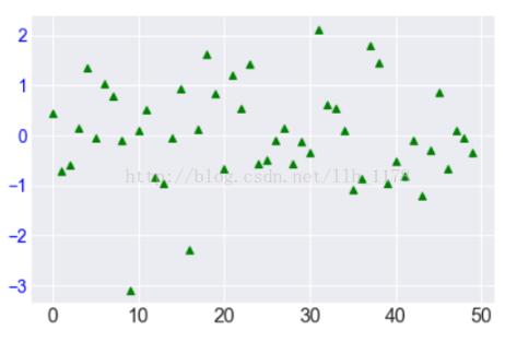
這張圖就通過rcParams()函數設置了y軸的字體顏色,x軸的字體大小。同時,將點的marker變成了三角形、顏色變為了綠色。
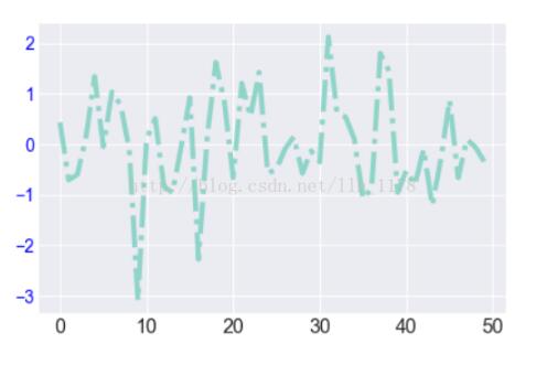
mpl.rc()函數;它可以用來設置線的粗細、風格、顏色等。
mpl.rc(’lines’, linewidth=4, color=’r’, linestyle=’-.’)plt.plot(data)
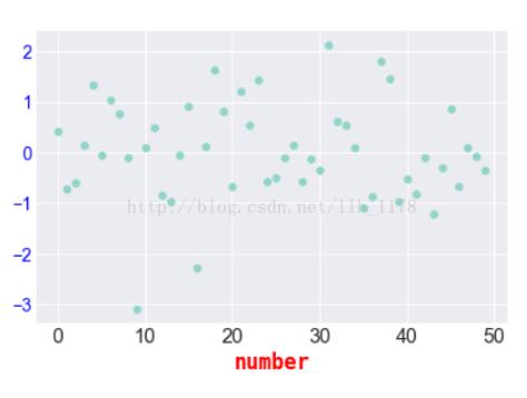
fontdict()函數;也可以來辦同樣的事情。
font = {’family’ : ’monospace’, ’weight’ : ’bold’, ’size’ : ’larger’, ’color’ : 'r' }plt.scatter(range(50), data)plt.xlabel('number', fontdict=font)
font()字典中主要存在這么幾類鍵:
font.family ;一共有5種設置: serif sans-serif cursive antasy monospace
font.style ;一種有3種設置:normal italic oblique
font.variant ;一共有2種設置:normal or small-caps
font.weight ;一共有4種設置:normal, bold, bolder, lighter
font.stretch ;一共有13種設置:
ultra-condensed, extra-condensed, condensed, semi-condensed, normal, semi-expanded, expanded, extra-expanded, ultra-expanded, wider, and narrower. font.size ;默認值是10pt
plt.setp()函數;也是可以設置線的粗細以及顏色,還可以設置坐標軸的方向,位置。
例如:
setp(lines, ’linewidth’, 2, ’color’, ’r’)
借用幫助文檔上的一個例子:
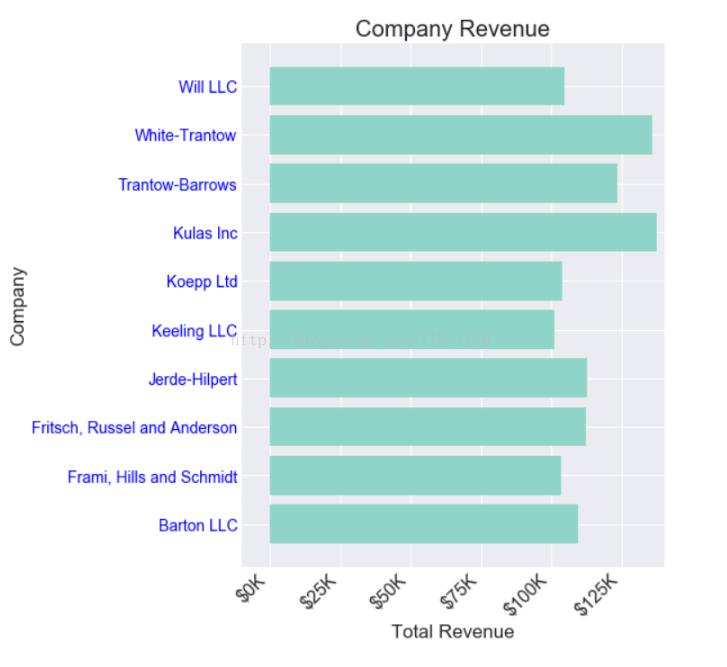
import numpy as npimport matplotlib.pyplot as pltdata = {’Barton LLC’: 109438.50, ’Frami, Hills and Schmidt’: 103569.59, ’Fritsch, Russel and Anderson’: 112214.71, ’Jerde-Hilpert’: 112591.43, ’Keeling LLC’: 100934.30, ’Koepp Ltd’: 103660.54, ’Kulas Inc’: 137351.96, ’Trantow-Barrows’: 123381.38, ’White-Trantow’: 135841.99, ’Will LLC’: 104437.60}group_data = list(data.values())group_names = list(data.keys())group_mean = np.mean(group_data)fig, ax = plt.subplots()ax.barh(group_names, group_data)labels = ax.get_xticklabels()plt.setp(labels, rotation=45, horizontalalignment=’right’)ax.set(xlim=[-10000, 140000], xlabel=’Total Revenue’, ylabel=’Company’, title=’Company Revenue’)
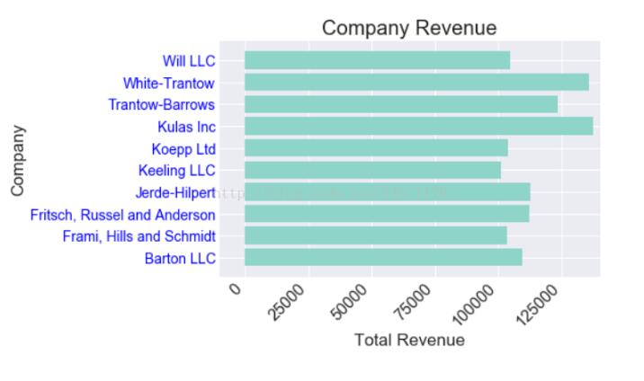
可以看到x軸坐標斜向45°旋轉了,整個圖片變得更加美觀了。為了對數據更加一步分析,做下面操作:
def currency(x, pos): '''The two args are the value and tick position''' if x >= 1e6: s = ’${:1.1f}M’.format(x*1e-6) else: s = ’${:1.0f}K’.format(x*1e-3) return sformatter = FuncFormatter(currency)fig, ax = plt.subplots(figsize=(6, 8))ax.barh(group_names, group_data)labels = ax.get_xticklabels()plt.setp(labels, rotation=45, horizontalalignment=’right’) ax.set(xlim=[-10000, 140000], xlabel=’Total Revenue’, ylabel=’Company’, title=’Company Revenue’)ax.xaxis.set_major_formatter(formatter)fig, ax = plt.subplots(figsize=(8, 8))ax.barh(group_names, group_data)labels = ax.get_xticklabels()plt.setp(labels, rotation=45, horizontalalignment=’right’) # 以所有收益的平均值畫一條垂直線,看哪些公司是超越平均收益的ax.axvline(group_mean, ls=’--’, color=’r’) # 標注新成立的公司for group in [3, 5, 8]: ax.text(145000, group, 'New Company', fontsize=10, verticalalignment='center') # 將標題移動一點,與圖片保持一點距離。ax.title.set(y=1.05)ax.set(xlim=[-10000, 140000], xlabel=’Total Revenue’, ylabel=’Company’, title=’Company Revenue’)ax.xaxis.set_major_formatter(formatter)ax.set_xticks([0, 25e3, 50e3, 75e3, 100e3, 125e3])plt.show()
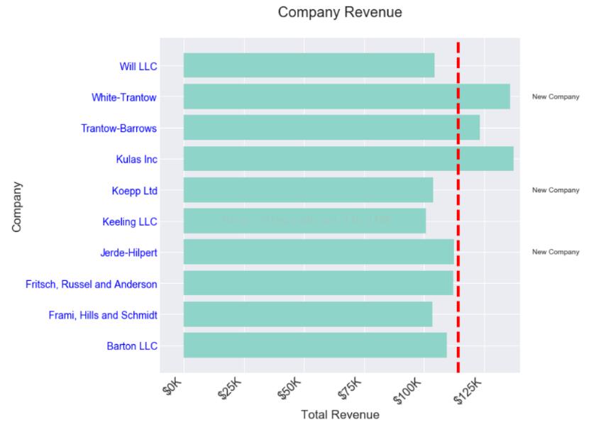
現在好了,可以直觀的看出哪些公司是新成立得,同時哪些公司的收益是超越平均水平的。對之后的數據分析和統計都是有非常大的幫助的。
以上這篇python畫圖常規設置方式就是小編分享給大家的全部內容了,希望能給大家一個參考,也希望大家多多支持好吧啦網。
相關文章:

 網公網安備
網公網安備