python_matplotlib改變橫坐標和縱坐標上的刻度(ticks)方式
用matplotlib畫二維圖像時,默認情況下的橫坐標和縱坐標顯示的值有時達不到自己的需求,需要借助xticks()和yticks()分別對橫坐標x-axis和縱坐標y-axis進行設置。
import numpy as npimport matplotlib.pyplot as pltx = range(1,13,1)y = range(1,13,1)plt.plot(x,y)plt.show()
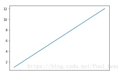
x坐標和y坐標都表示1到12的整數,不進行坐標設置時,執行效果為:
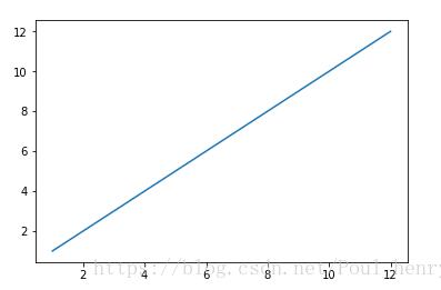
此時的x軸和y軸都是只顯示偶數,其它的奇數未顯示,這樣在展示實驗效果或放入文章中都會影響其可讀性。
為了設置坐標軸的值,增加其可讀性,有多種方法。這里介紹的是matplotlib的函數xticks()和yticks()。
參考文檔:xticks()函數介紹 yticks()函數介紹
xticks()中有3個參數:
xticks(locs, [labels], **kwargs) # Set locations and labels
locs參數為數組參數(array_like, optional),表示x-axis的刻度線顯示標注的地方,即ticks放置的地方,上述例子中,如果希望顯示1到12所有的整數,就可以將locs參數設置為range(1,13,1),第二個參數也為數組參數(array_like, optional),可以不添加該參數,表示在locs數組表示的位置添加的標簽,labels不賦值,在這些位置添加的數值即為locs數組中的數。
如下圖
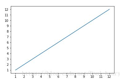
import numpy as npimport matplotlib.pyplot as pltx = range(1,13,1)y = range(1,13,1)plt.plot(x,y)plt.xticks(x)plt.show()
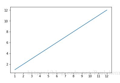
xticks()函數中,locs參數為數組x,即1到12所有的整數, 即畫出的圖像會在這12個位置畫出ticks,即上圖中的刻度線。
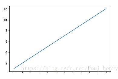
當賦予labels的值為空時,則在locs決定的位置上雖然會畫出ticks,但不會顯示任何值。
import numpy as npimport matplotlib.pyplot as pltx = range(1,13,1)y = range(1,13,1)plt.plot(x,y)plt.xticks(x,())plt.show()
其效果為:
該例子中,會明顯看到locs和labels的關系,locs表示位置,labels決定這些位置上的標簽,labels的默認值為和locs相同。
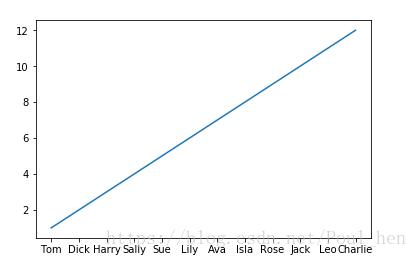
所以,對于labels參數,我們可以賦予其任意其它的值,如人名,月份等等。
import numpy as npimport matplotlib.pyplot as pltx = range(1,13,1)y = range(1,13,1)plt.plot(x,y)plt.xticks(x, (’Tom’,’Dick’,’Harry’,’Sally’,’Sue’,’Lily’,’Ava’,’Isla’,’Rose’,’Jack’,’Leo’,’Charlie’))plt.show()
在每個標簽會依次顯示labels中的人名:
還可以顯示月份:
import numpy as npimport matplotlib.pyplot as pltimport calendarx = range(1,13,1)y = range(1,13,1)plt.plot(x,y)plt.xticks(x, calendar.month_name[1:13],color=’blue’,rotation=60)plt.show()
顯示效果為:
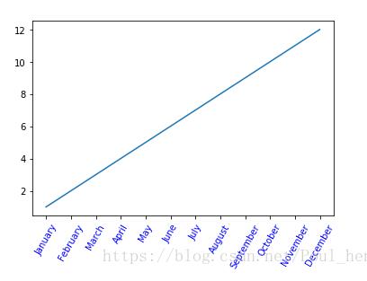
這里添加了 calendar 模塊,用于顯示月份的名稱。calendar.month_name[1:13]即1月份到12月份每個月份的名稱的數組。后面的參數color=’blue’表示將標簽顏色置為藍色,rotation表示標簽逆時針旋轉60度。
通過上個示例,可看出第3個參數關鍵字參數**kwargs用于控制labels,具體可通過Text屬性中的定義,添加到該參數中,關于其定義可參考在 Text 查詢。
另外,通過第1個參數locs可以看出,xticks()函數還可以用來設置使x軸上ticks隱藏,即將空數組賦予它,則沒有tick會顯示在x軸上,此處參考:x軸數值隱藏。
import numpy as npimport matplotlib.pyplot as pltimport calendarx = range(1,13,1)y = range(1,13,1)plt.plot(x,y)plt.xticks([])plt.show()
可看出x軸上沒有tick顯示:
同理,對于yticks()函數定義和xticks()函數定義完全相同。對于第一個例子,如果希望在y軸上的刻度線也顯示1到12所有的整數,則將lens(1,13,1)賦予yticks()的locs參數即可:
import numpy as npimport matplotlib.pyplot as pltimport calendarx = range(1,13,1)y = range(1,13,1)plt.plot(x,y)plt.xticks(x)plt.yticks(y)plt.show()
其效果為:
綜上,可以設計一個x軸為月份,y為星期的圖像:
import numpy as npimport matplotlib.pyplot as pltimport calendarfrom datetime import *x = range(1,13,1)y = range(1,13,1)plt.plot(x,y)plt.xticks(x, calendar.month_name[1:13],color=’blue’,rotation=60)today = datetime(2018, 9, 10)a=[]for i in range(12): a.append(calendar.day_name[today.weekday()+(i%7)])plt.yticks(y,a,color=’red’)plt.show()

對應一月份選擇星期一,二月份選擇星期二,往后依次類推,直至將12個月安排完。
以上這篇python_matplotlib改變橫坐標和縱坐標上的刻度(ticks)方式就是小編分享給大家的全部內容了,希望能給大家一個參考,也希望大家多多支持好吧啦網。
相關文章:
 網公網安備
網公網安備